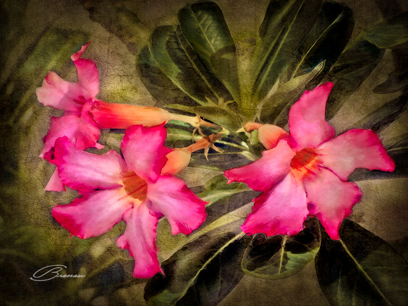
Lost in Time
Lost in Time (but not in Space because I knew where it was all the time), this low-resolution image was taken while traveling to some beach in Mexico with my daughter and her boyfriend long ago. These flowers were there, on the sidewalk, in front of a store, with the Sun hitting hard.
Nevertheless, I used a soft flash to compensate some shadows below with the excess of light coming from above as I thought flash would be the best thing to do at the moment. But, that was back then!
Still, it turned out to be not really good so I decided to give it a chance by applying some artwork to it. By definition – if ever art might have a perfect definition – artwork is the (a person’s) interpretation of what you see on a canvas using whichever medium you have on hand.
In this case, starting with a picture which would be my canvas, using Photoshop as my set of brushes and paint tools, I would apply a series of filters and digital procedures to materialize what I have in mind and produce another image that would be my final piece of art.
Initially, I performed the usual treatment to every photograph by adjusting colors and light and then removing unwanted artifacts.
Next, I applied a watercolor effect that takes more that 15 hours to be processed! The trick to cut this time to about two hours only was to split the image in two, apply the effect to each part and then put them back together seamlessly.
Most parts of the picture resulted very good, specially on the flowers, but the rest was too grainy and created nasty patterns that could render everything else useless. One alternative was to use the oil paint effect to clean details only on these undesired patterns.
To give a darker look on the background, I added a rough pattern that I found lying on my pattern files. This pattern also has another purpose: to selectively hide some distracting details like the leaves at the left and the branch up top.
The following steps were pure art and imagination as I manually applied watercolor washes using a pen and a tablet to each one of the pink petals. On top of that, I did the same with the green leaves in the background to intensify their contrast.
Finally, I gave some light in the background and a vignette to enhance the flowers.
Enjoy!

No Comments